ColorNise
ColorNise is an upcoming 2D chess-inspired online strategy game for PC - I was hired as Lead Artist to establish a cohesive visual identity across the project.
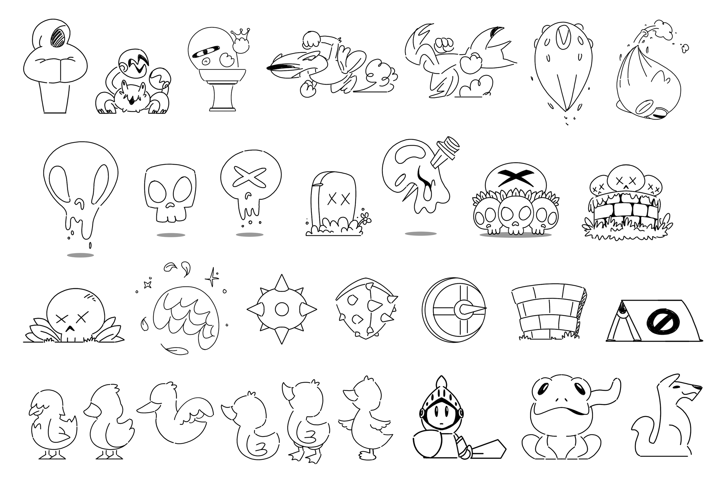
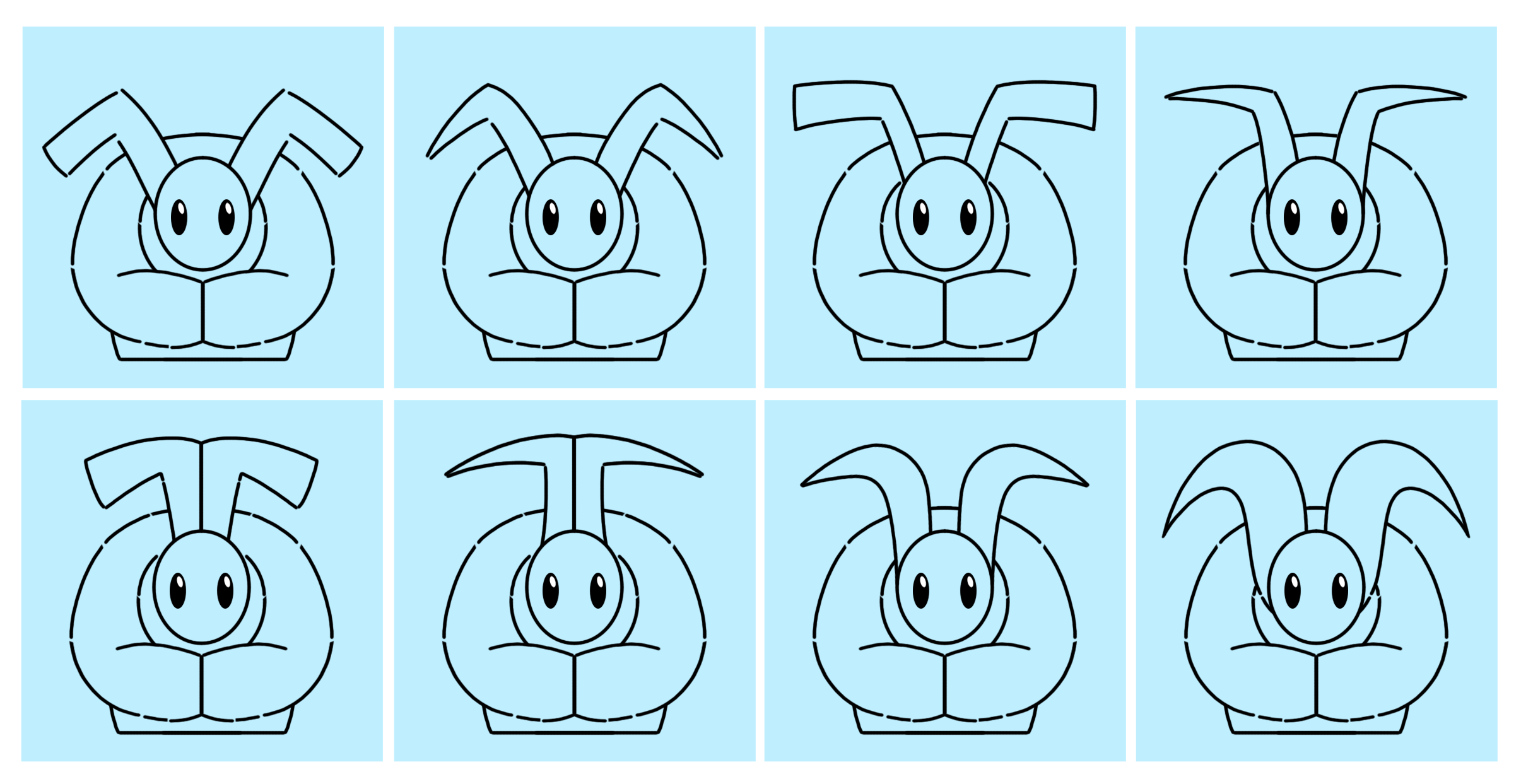
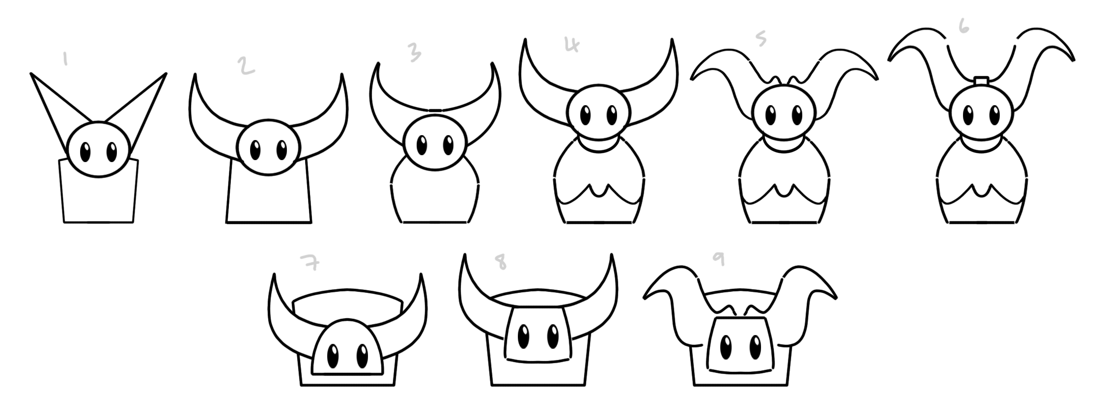
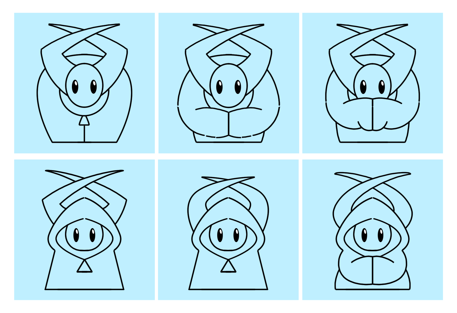
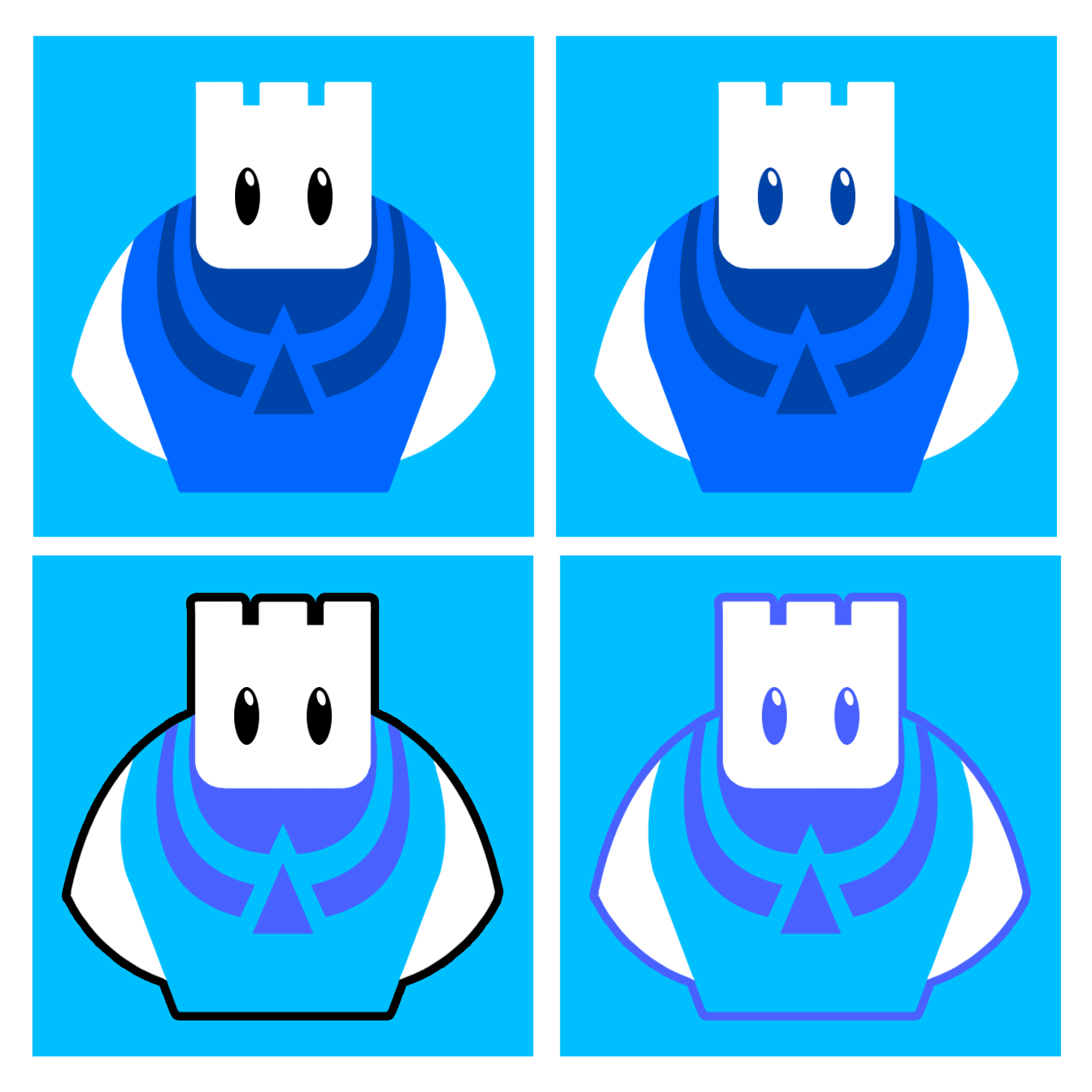
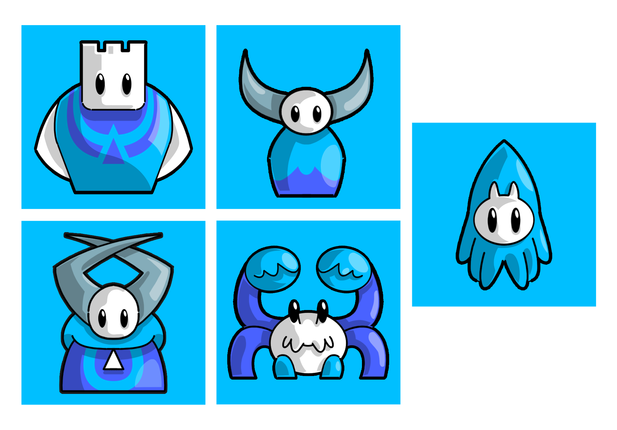
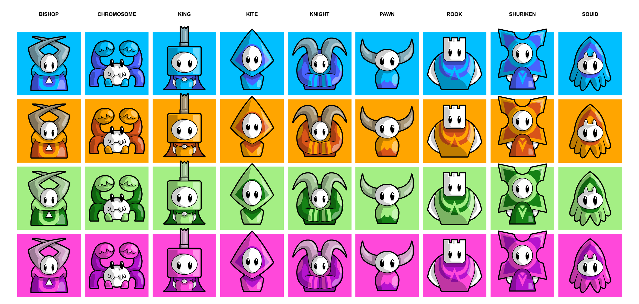
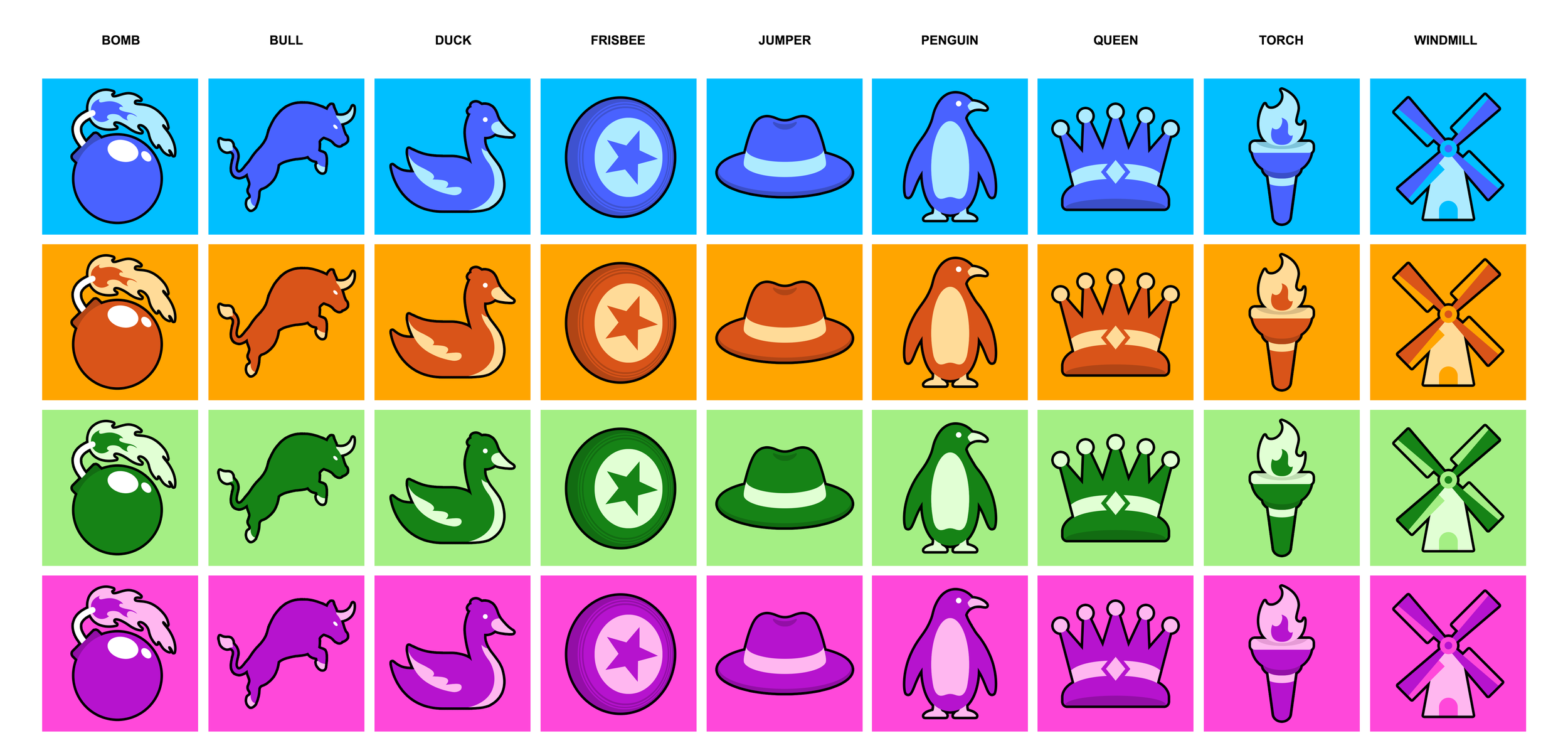
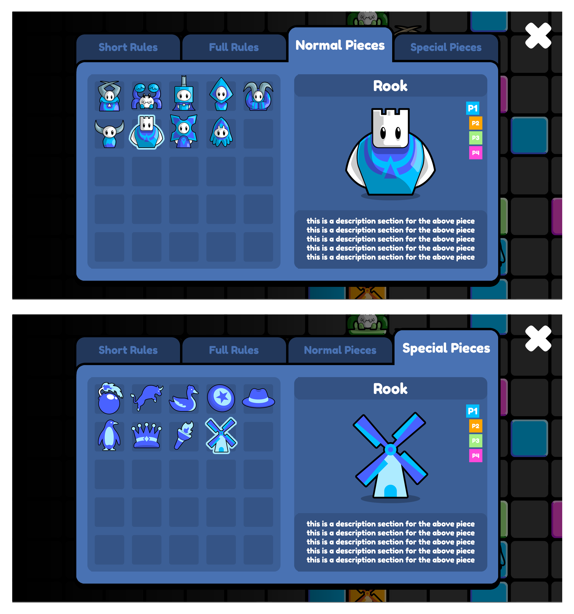
Early in development, I was tasked with creating initial character concepts that could function as physical chess-inspired game pieces within gameplay.
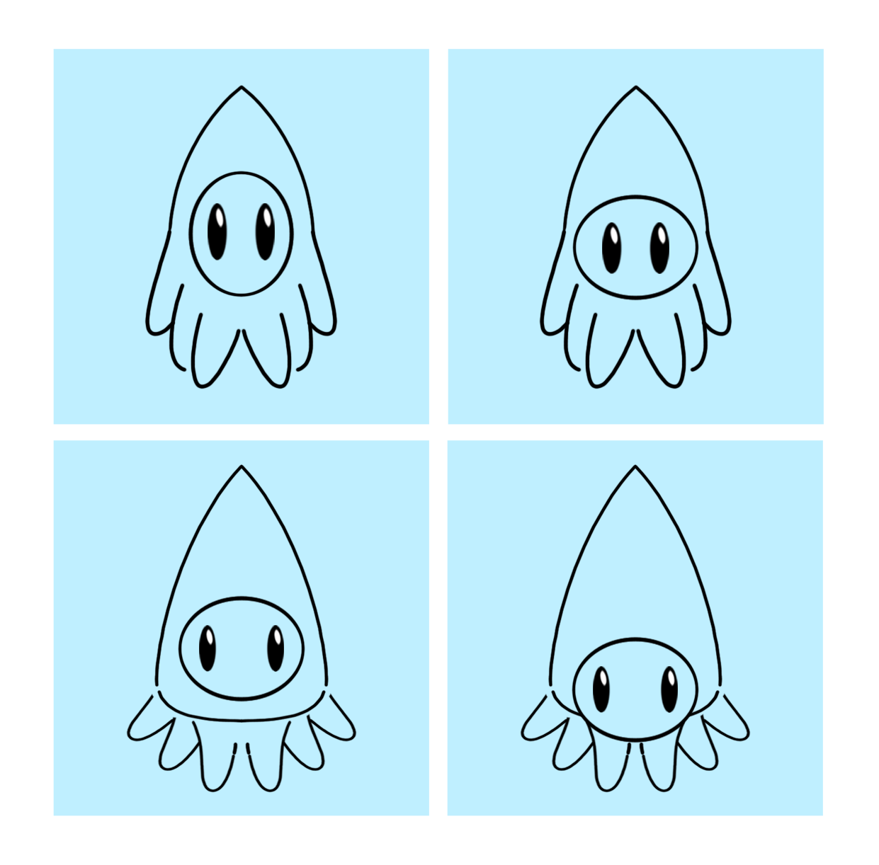
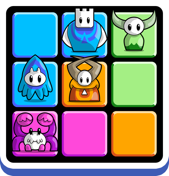
Based on written descriptions for each piece, I produced a range of exploratory designs that later evolved into more silhouette-driven concepts, prioritising clear shapes, scale variation, and readability. The goal was to keep every piece visually simple yet immediately identifiable, helping players naturally understand piece roles and strategic value through consistent visual language and recognisable forms.
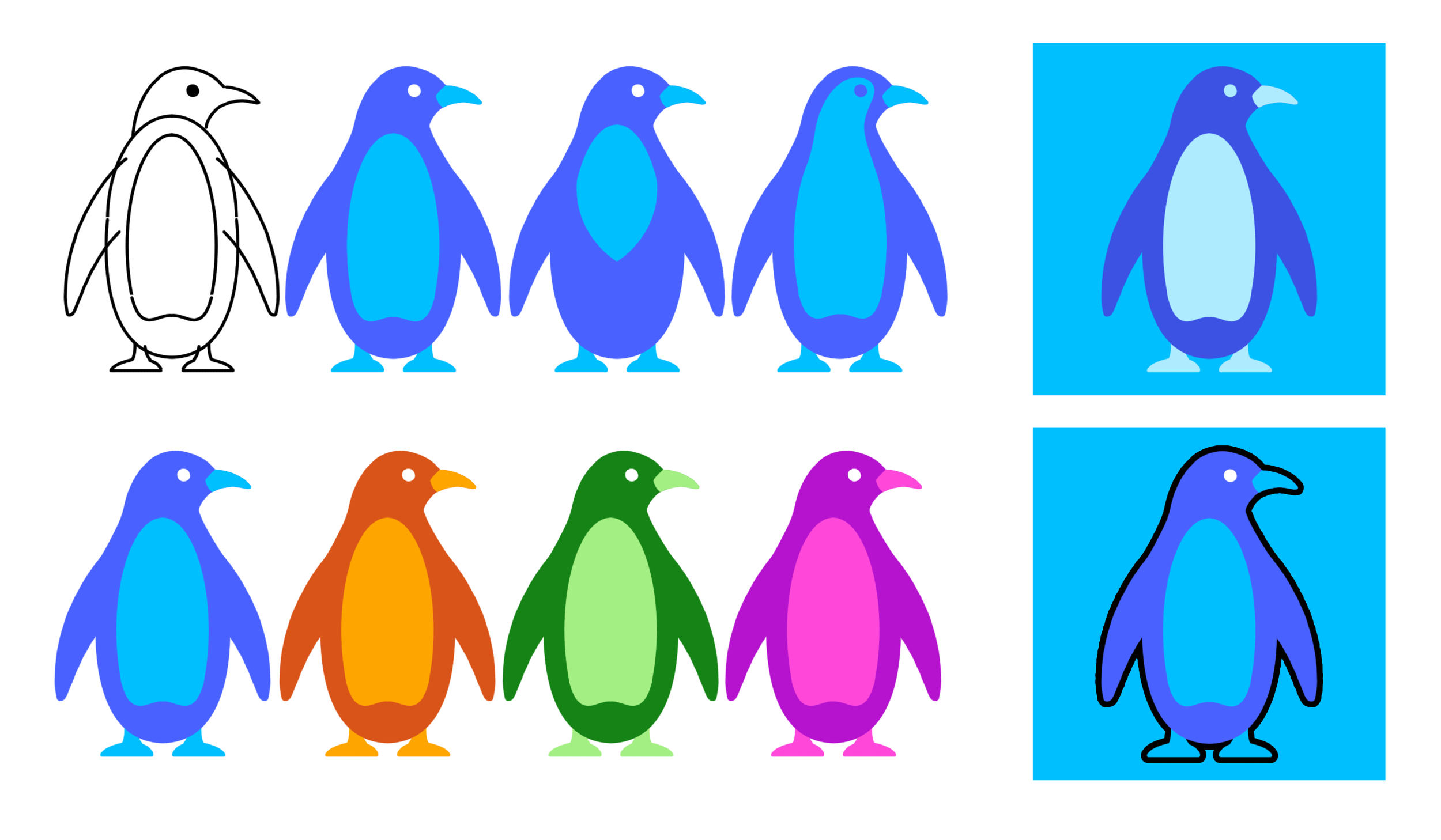
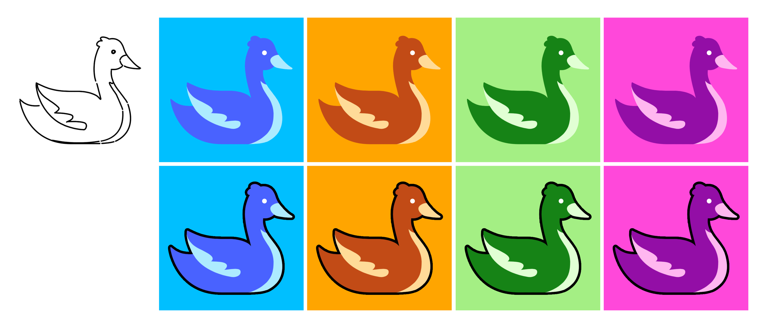
ColorNise's character roster was divided into normal and special pieces, each with its own visual direction and identity. Normal pieces were developed as stylised alien-like characters, whereas special pieces were based on recognisable real-world animals and objects, helping players quickly distinguish between gameplay types and abilities at a glance.
Concept Art | Character Design | Animation | UI Design
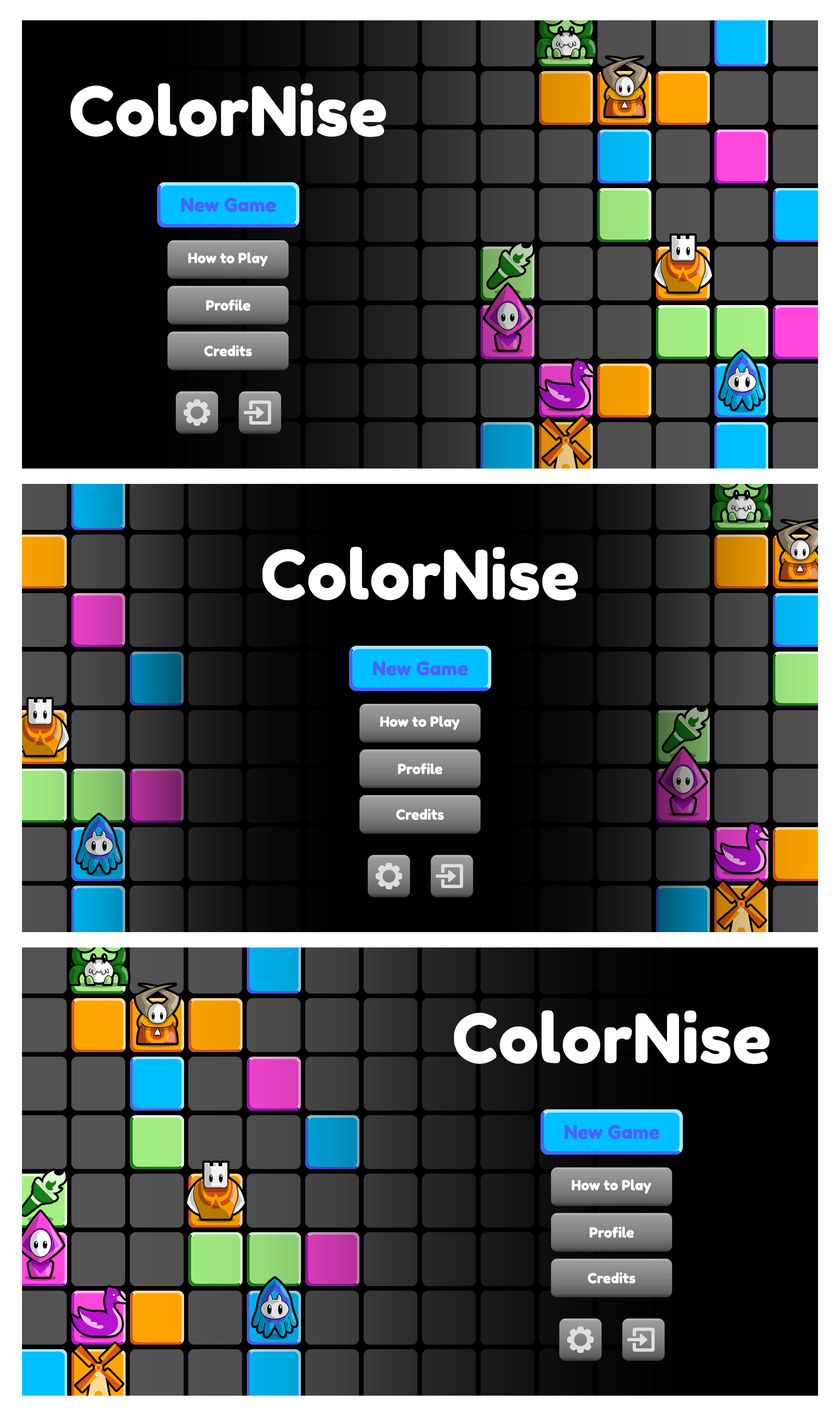
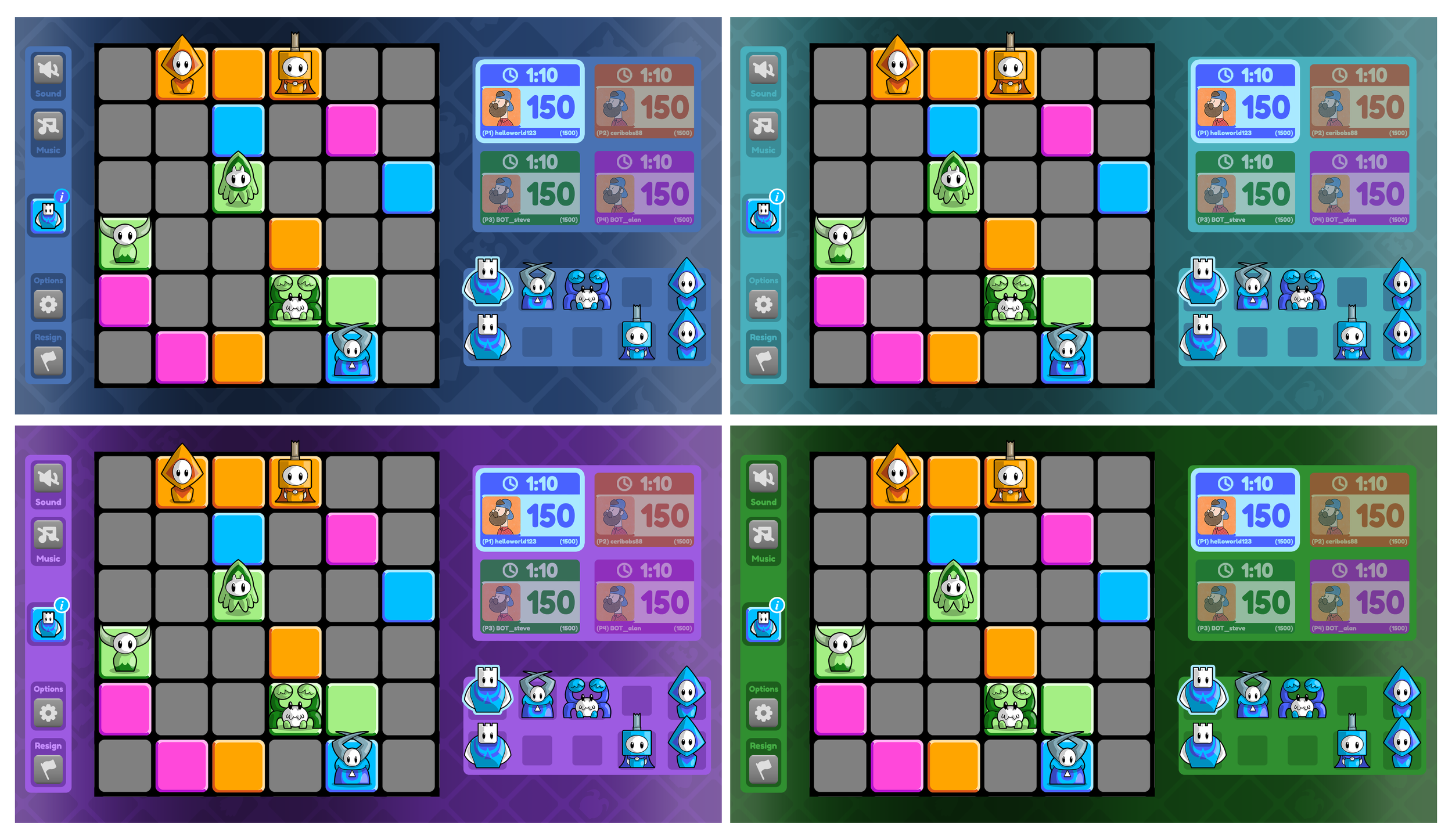
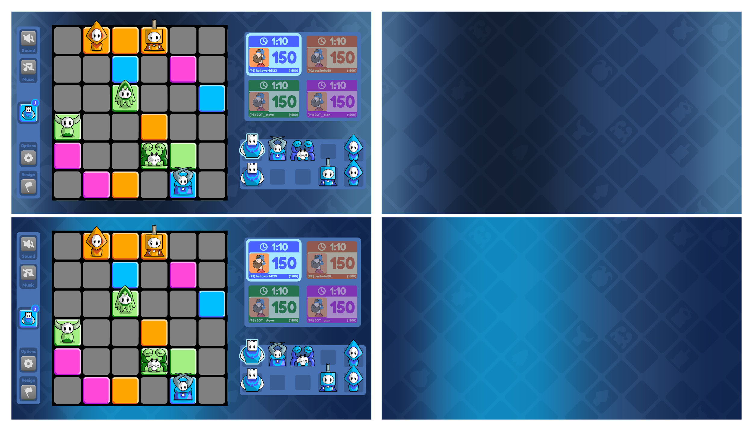
Game Board & effects
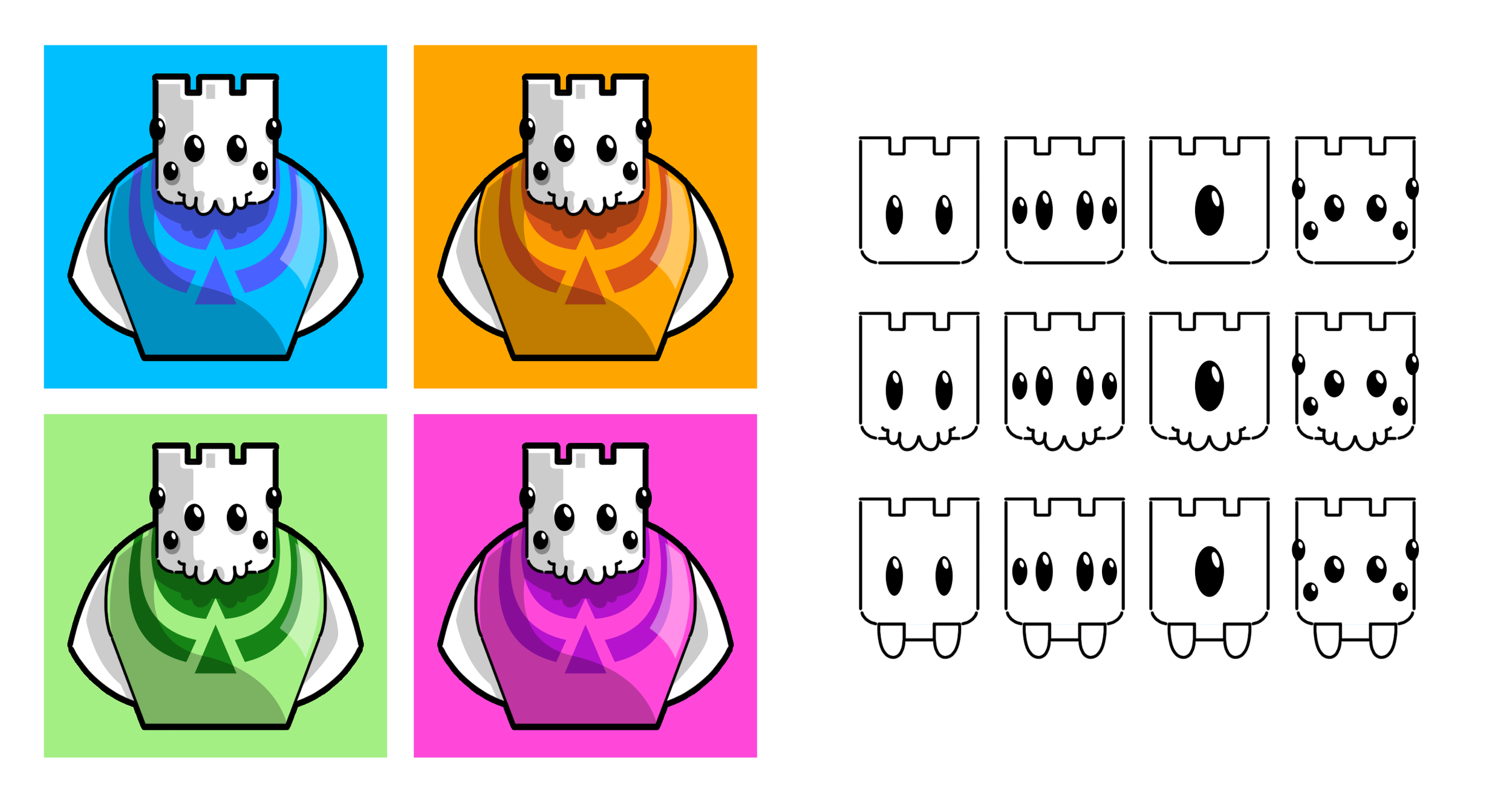
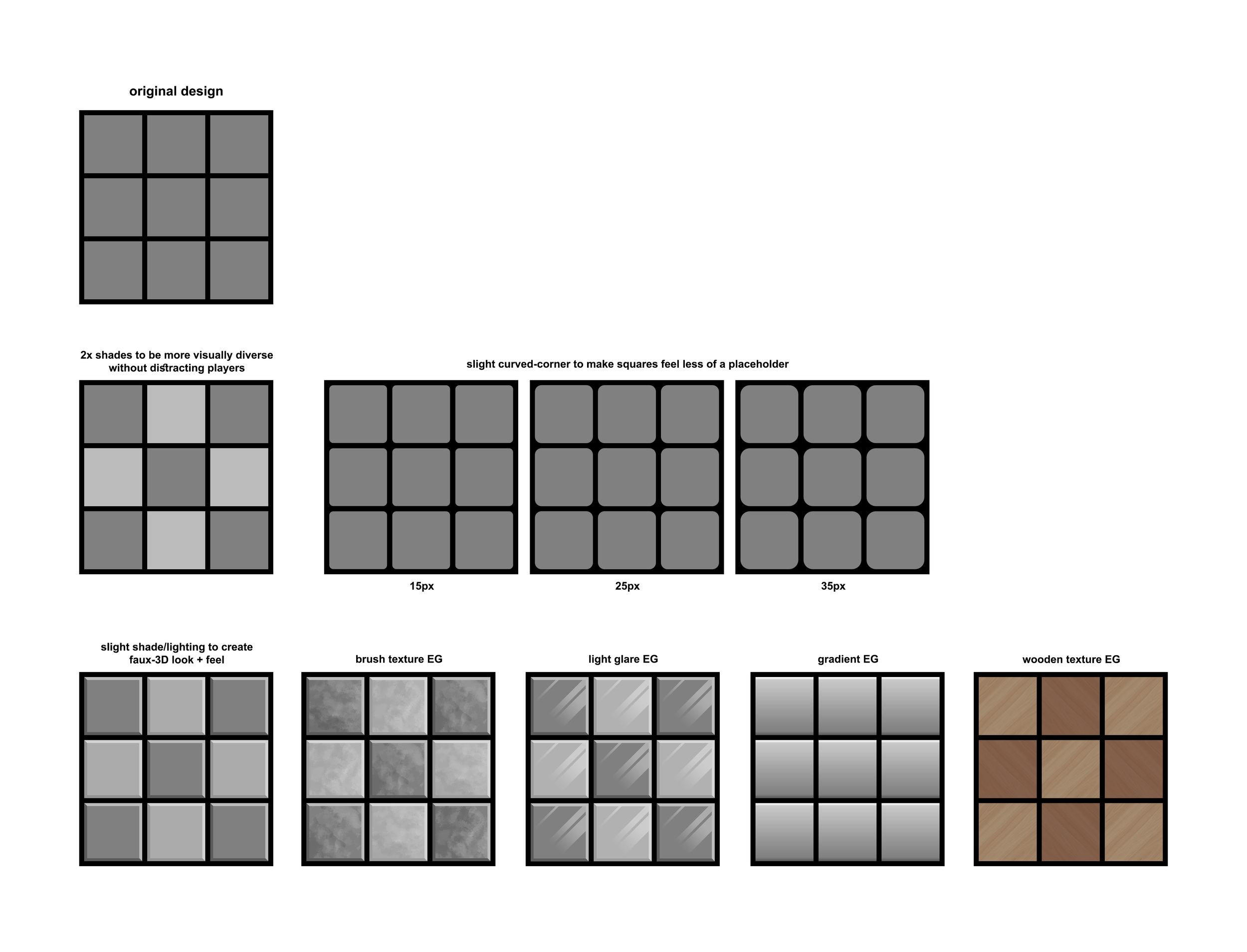
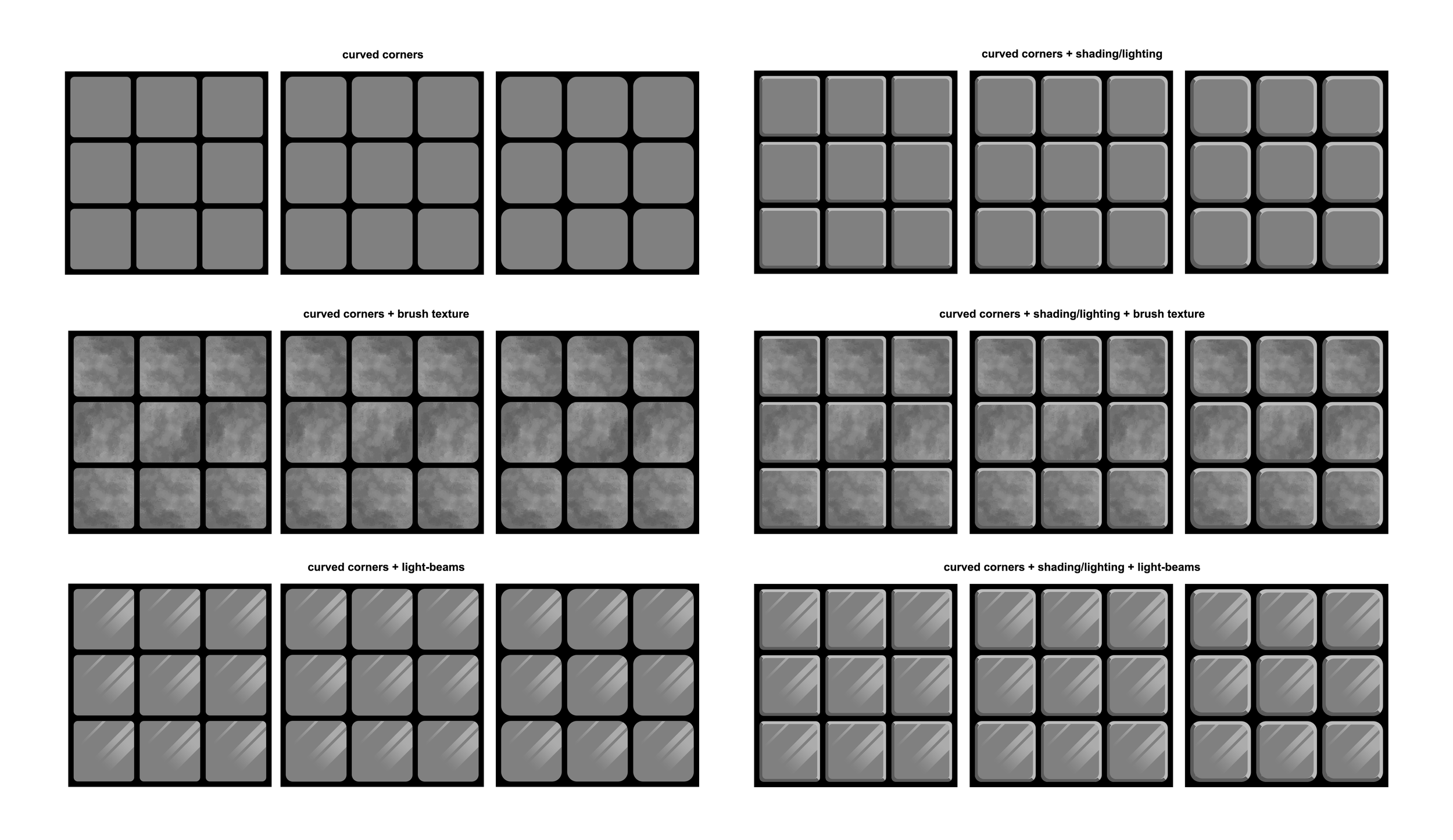
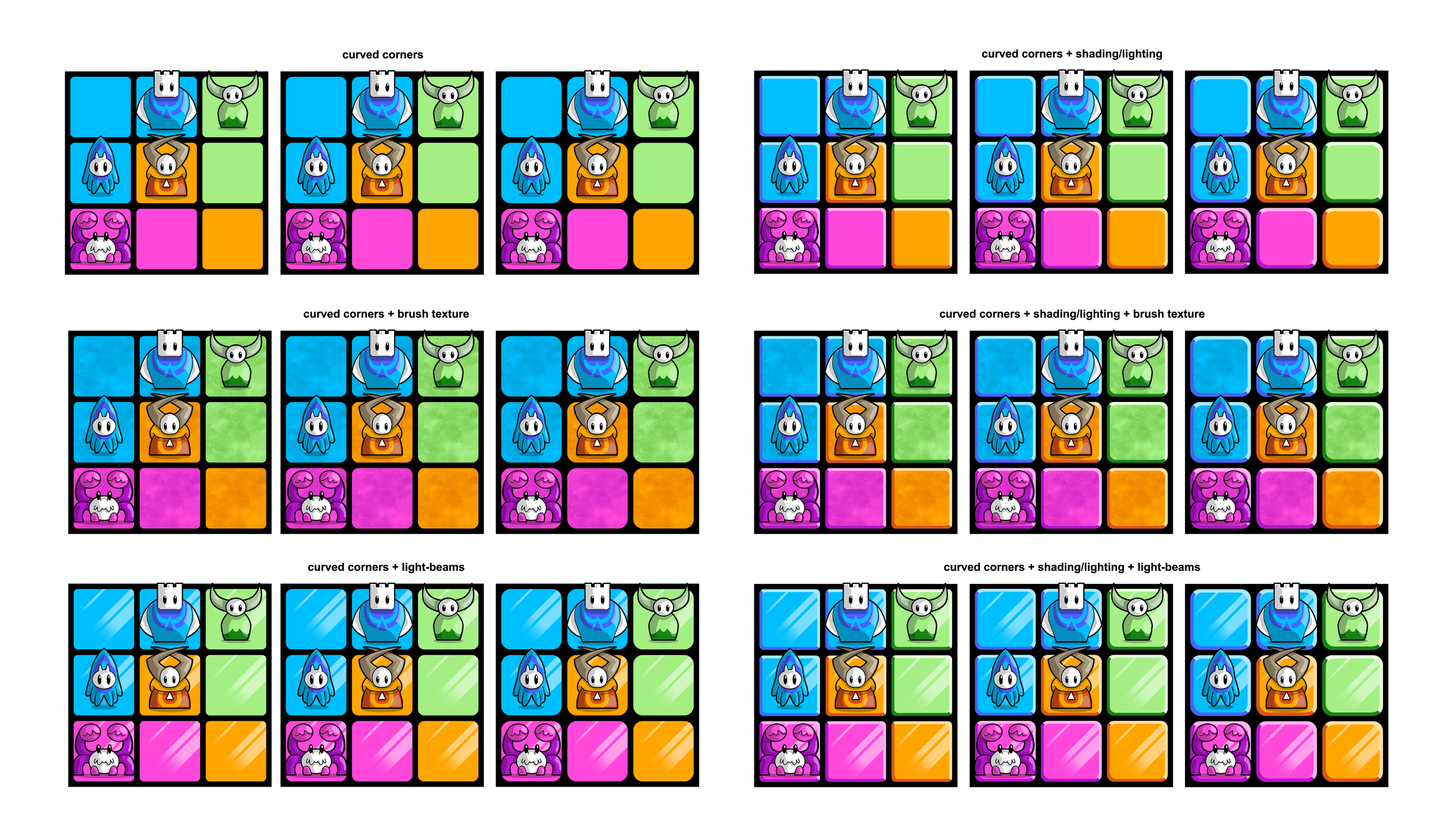
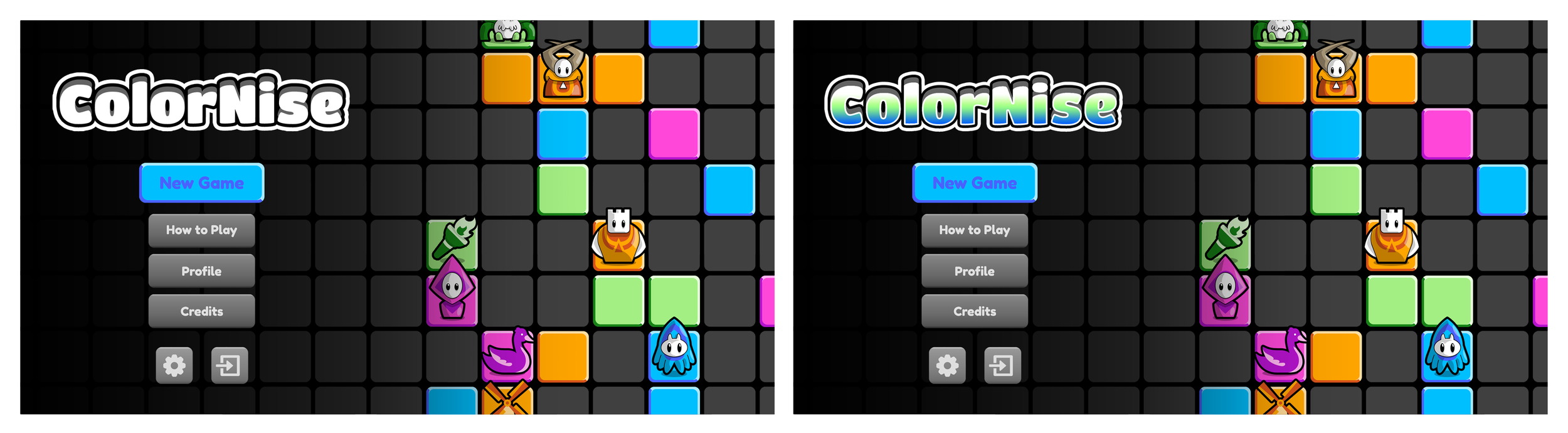
I worked towards refining the game board while preserving the core look of the original design. I explored multiple approaches to tile shape, with lighting, shading, and gradient effects added for a more polished visual style.
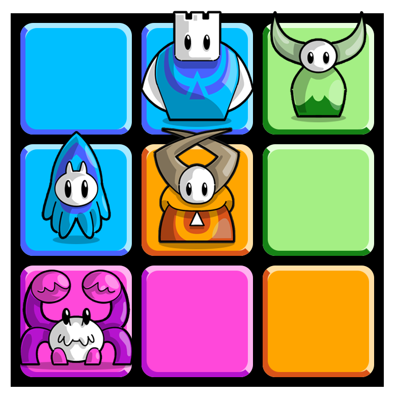
Tiles by default are a neutral grey that then morph into player-specific colours as pieces are placed, reinforcing board control during gameplay. I produced a series of showcases demonstrating how the character pieces could look when placed on to the board tiles.
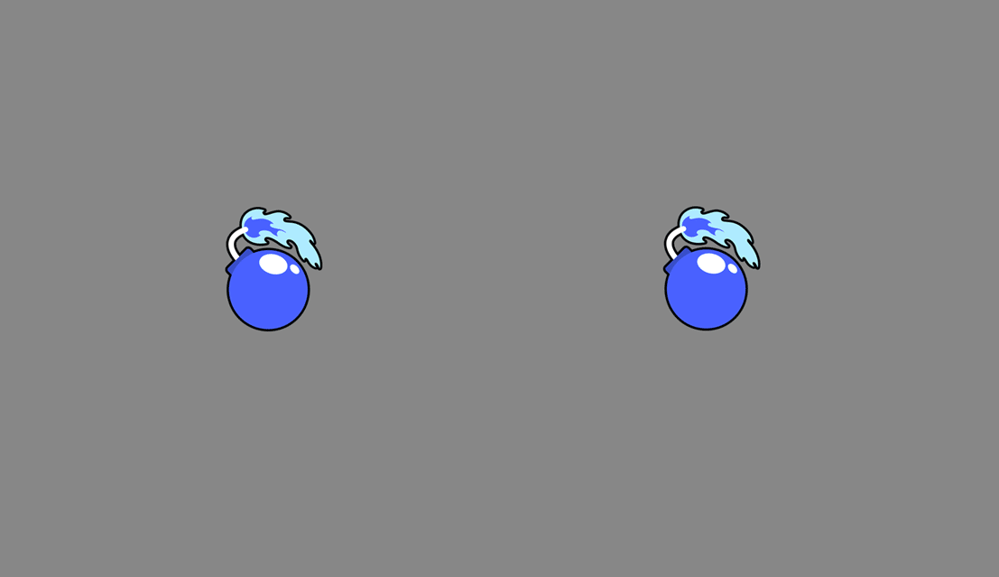
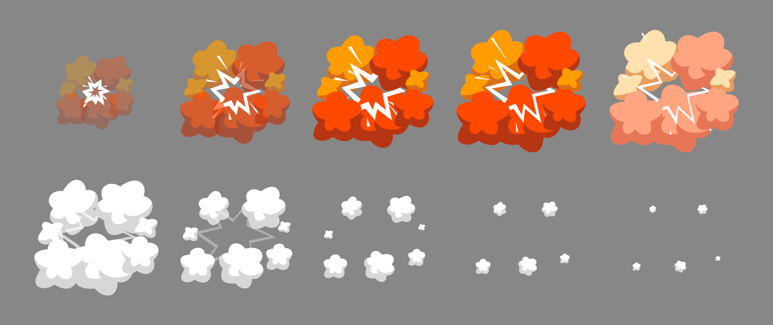
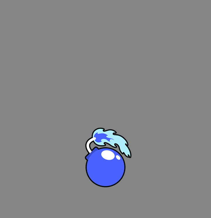
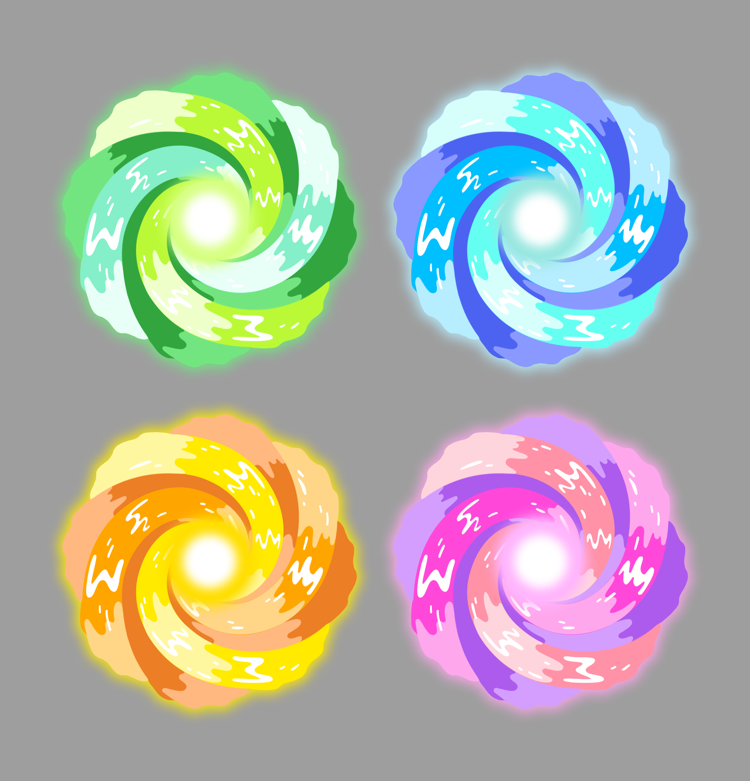
I also developed some animated visual effects for the game’s special pieces, including a frame-by-frame explosion effect and a stylised teleportation vortex animation. Each effect was designed to communicate gameplay actions clearly while matching the established visual style of the game. I created animated demonstrations of each showing how these effects would appear and behave during gameplay interactions.
UI Design
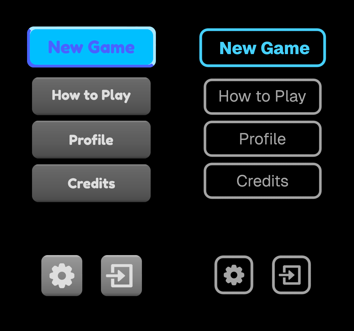
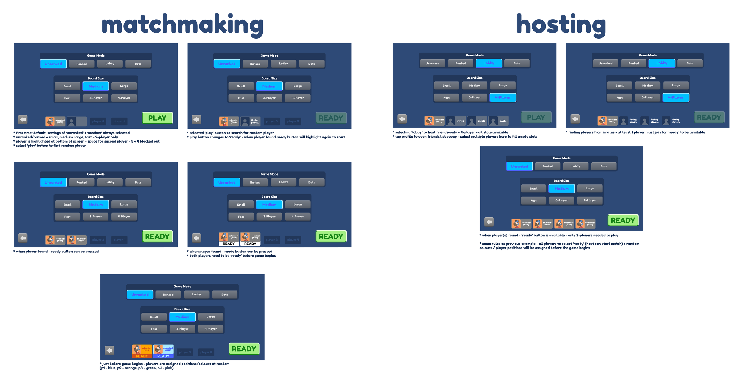
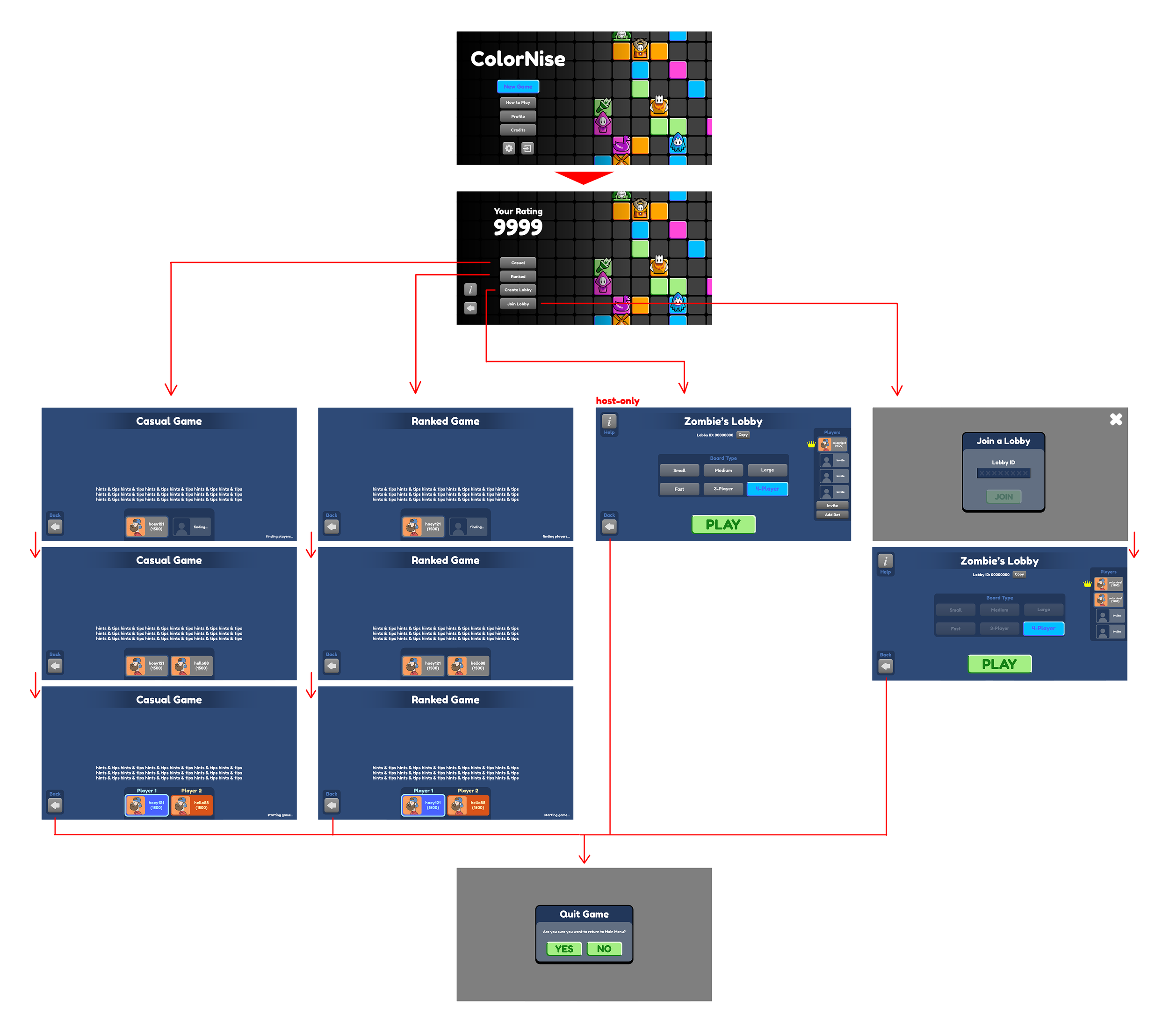
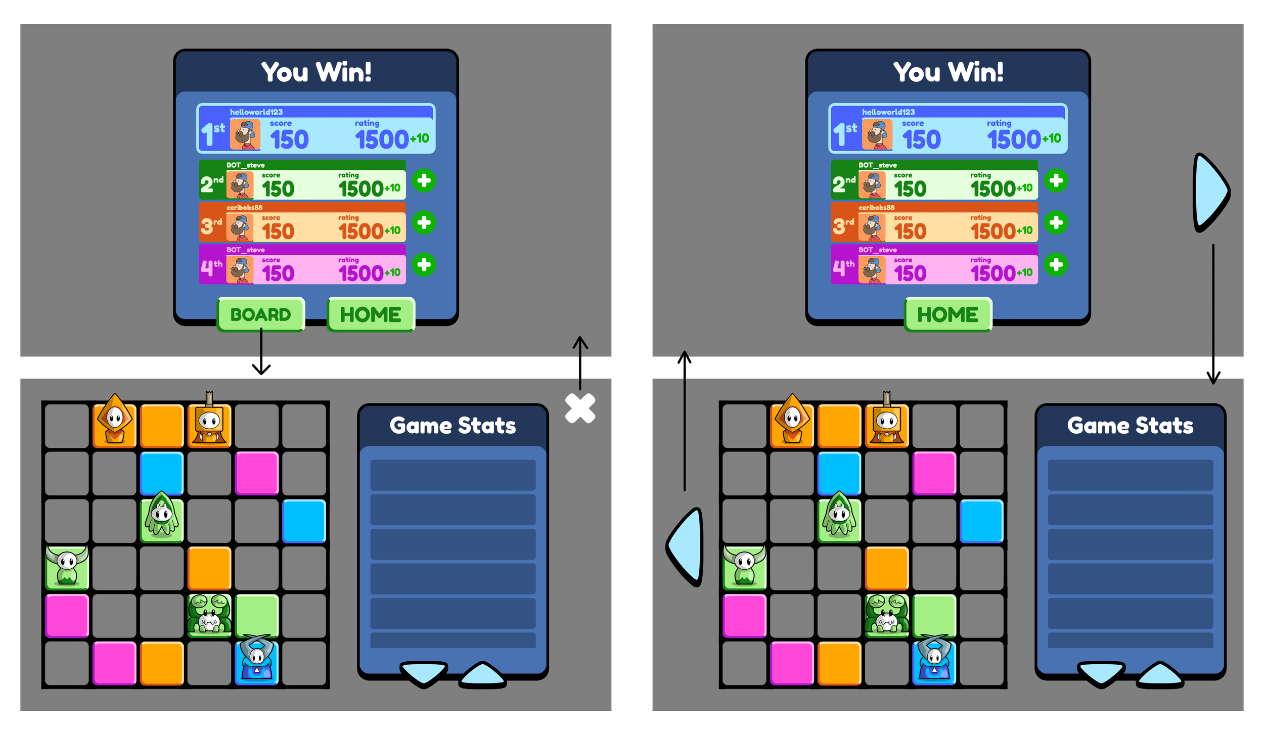
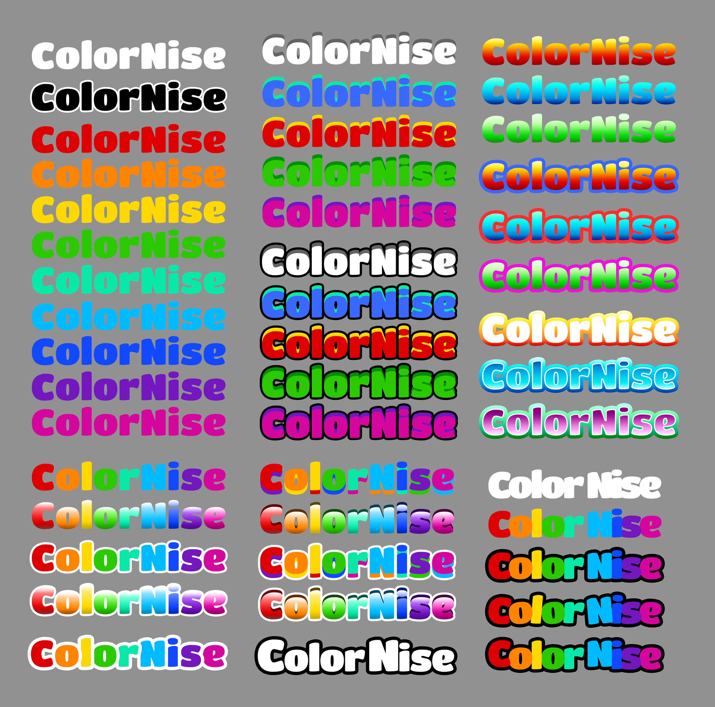
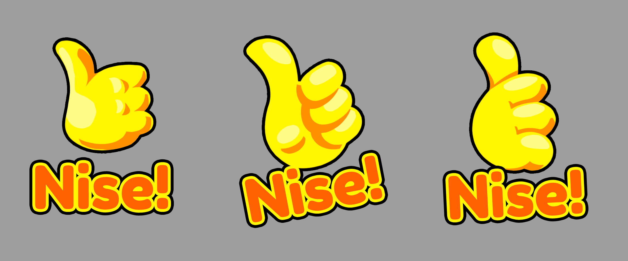
The final stage of the project focused on creating the overall UI and user experience for ColorNise, covering menus, buttons, backgrounds, logos, and exploratory emote designs.
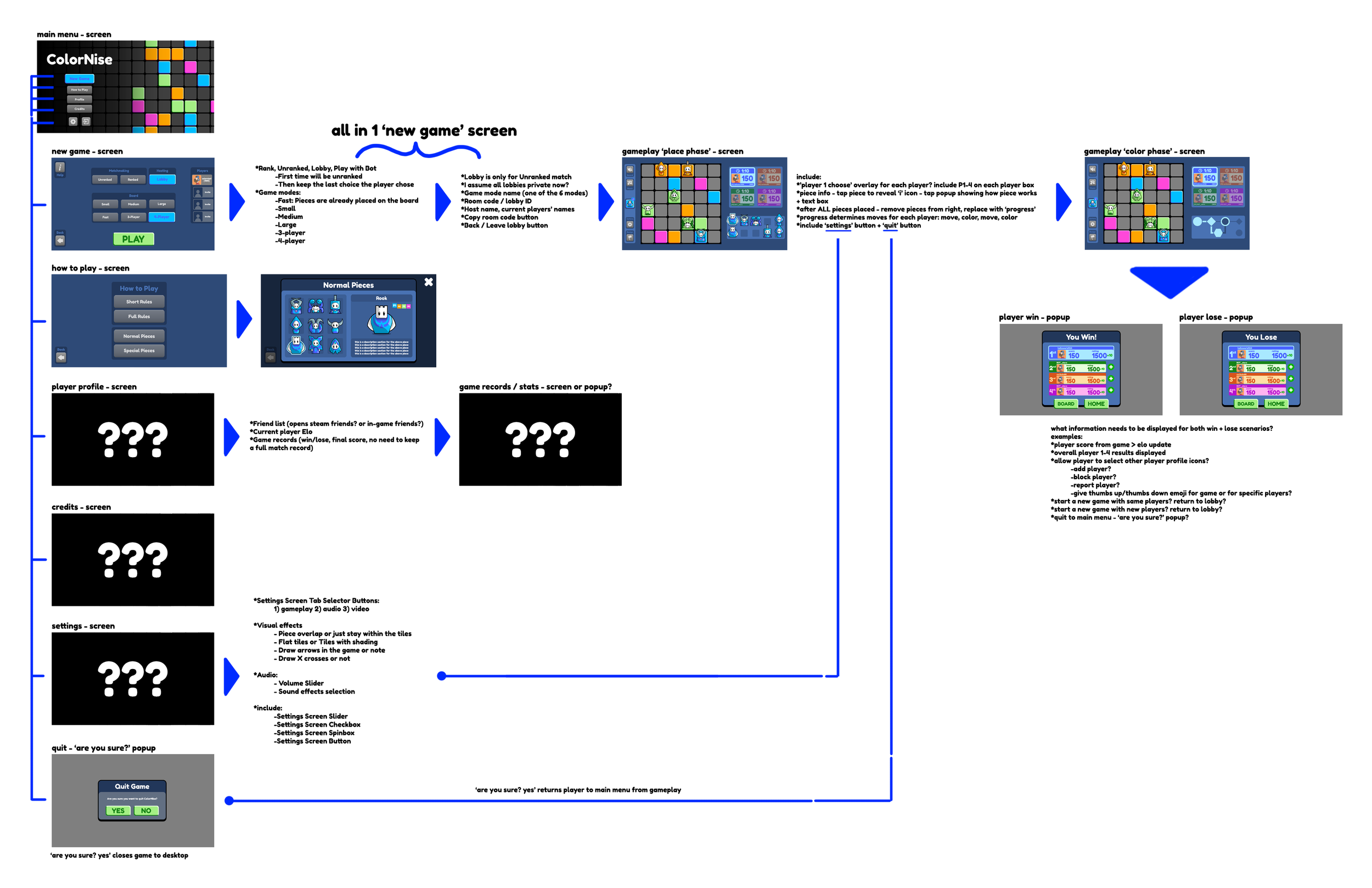
I developed an initial visual navigation guide mapping out connecting each menu screen and its intended function. This process helped create a user flow that would feel intuitive and accessible for both first-time and veteran players. The interface followed the same bold and simplified style used throughout the project, with strong shapes, readable typography, and easy-to-navigate layouts.
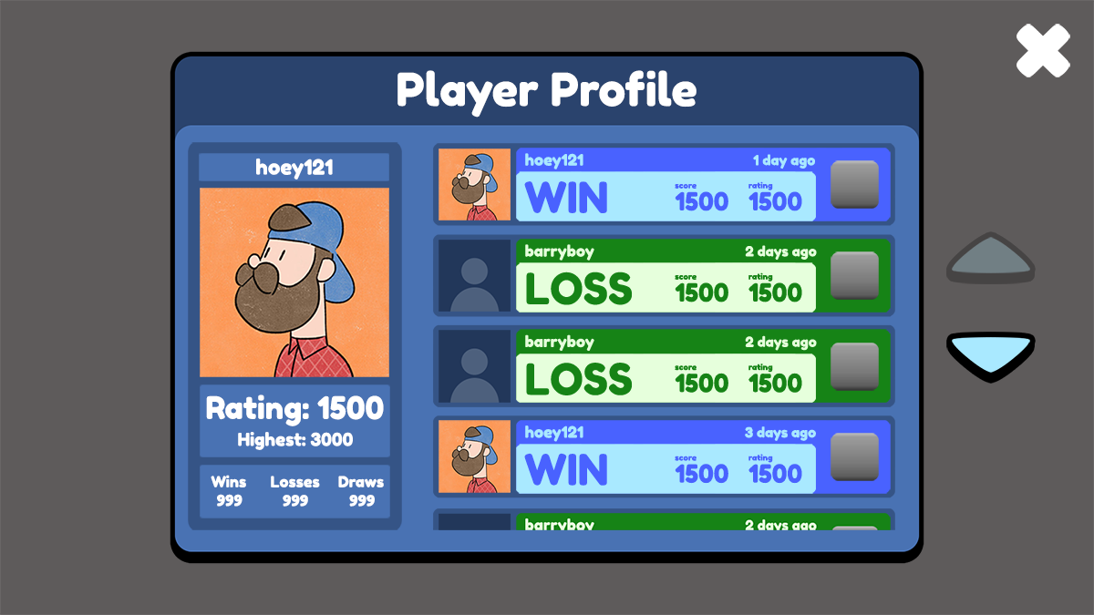
I produced high-priority UI mockups for core screens including the title menu, matchmaking lobbies, gameplay interface, and player profiles, ensuring all critical gameplay information and interactive elements were clearly communicated.
ColorNise
(2026)
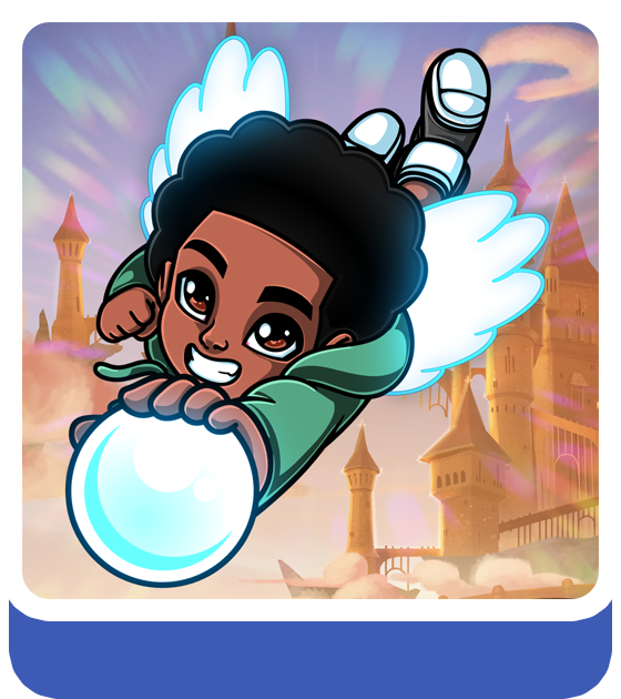
Kingdom Climb
(2021-2025)
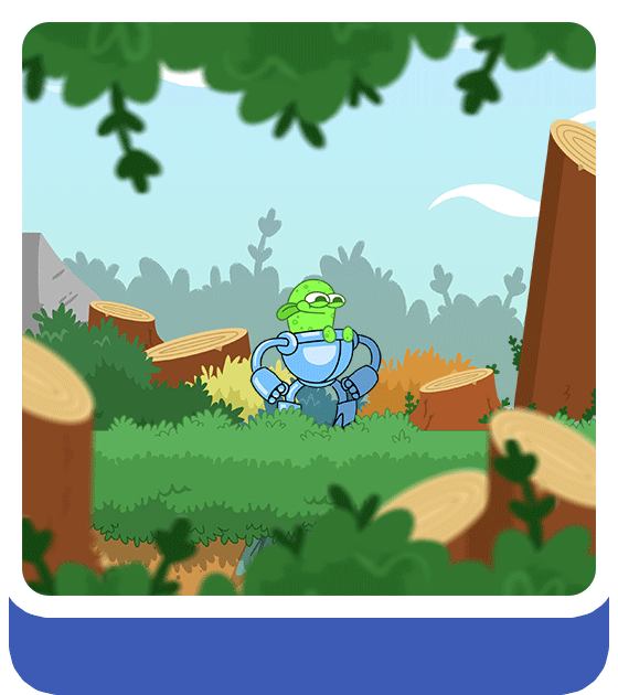
Grapple Goo Guy
(2025-)
SpaceBoy
(2015-)
Judo Jumper
(2017)